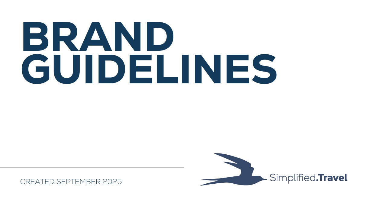

Simplified.Travel: Creating a Unified Brand Identity that Inspires Global Discovery
A detailed look at Simplified.Travel’s 2025 brand transformation—introducing a cohesive visual identity and style guide inspired by the Arctic Tern. The new framework strengthens global recognition, aligns creative direction, and captures the brand’s mission to help travelers explore, connect, and discover the world more meaningfully.
Creating a Cohesive Brand Identity: Simplified.Travel’s New Style Guide
In September 2025, I led a consulting project with Simplified.Travel to develop a comprehensive brand and style guide. The initiative established a unified visual identity and messaging framework to strengthen brand recognition and align creative direction with the company’s mission—connecting travelers with the world through exploration, renewal, and cultural connection.
At its core, Simplified.Travel’s brand draws inspiration from the Arctic Tern, a bird that migrates thousands of kilometers between the Earth’s poles each year. Much like the tern’s incredible global journey, the brand embodies the spirit of adventure, endurance, and discovery—a fitting symbol for a company committed to helping travelers explore the world more meaningfully.
A Visual Identity Rooted in Purpose
The Simplified.Travel logo is the cornerstone of the brand’s identity. With its sleek lines and stylized tern, the logo conveys motion, freedom, and connection—core values of the Simplified.Travel experience.
Logo guidelines ensure consistency and legibility across every platform:
- The primary vertical logo should always be used whenever possible for brand clarity.
- Secondary logos, including the horizontal, initials, and circular marks, are reserved for specific applications such as social media profiles, favicons, and limited-space environments.
- Clear space must always be maintained around the logo, and the design must remain undistorted and level.
- Only official logo files should be used—colors, proportions, or layouts should never be altered.
This disciplined approach ensures that the Simplified.Travel brand remains consistent, recognizable, and professional across all channels—from digital marketing to print collateral.
Color Palette: A Reflection of Exploration and Calm
The brand’s color system establishes a visual tone that balances trust, tranquility, and vitality—key emotions that resonate with global travelers.
Primary Palette:
Secondary Palette:
The result is a cohesive palette that’s both adventurous and grounded, capturing the essence of Simplified.Travel’s brand promise—to simplify the journey while celebrating the richness of exploration.
Typography: Clean, Modern, and Readable
Typography plays a central role in maintaining a polished and consistent look across Simplified.Travel’s communications. The brand uses the Nexa font family, chosen for its modern geometry and legibility in both digital and print applications.
Headings: Nexa Heavy – bold, strong, and confident.
Use for page titles and major section headings to establish hierarchy.
Subheadings: Nexa Light Bold – clear and refined for easy reading.
Use for secondary headings, captions, and supportive emphasis.
Body Text: Nexa Light – clean and approachable, perfect for conveying information simply.
Consistent use of hierarchy and spacing ensures a modern, streamlined aesthetic across all brand materials, from social content to travel guides and digital campaigns.
Bringing It All Together
The new Simplified.Travel brand guide isn’t just about design—it’s about creating a unified visual language that tells a story of connection and exploration. Every color, typeface, and logo placement reinforces the brand’s identity and builds trust with travelers worldwide.
This style guide provides the foundation for all creative work moving forward—ensuring that whether you encounter Simplified.Travel through its website, digital ads, printed materials, or social media, the experience is instantly recognizable, inspiring, and cohesive.
With this new framework in place, Simplified.Travel is ready to continue its journey of inspiring global discovery—one meaningful adventure at a time.
View the Simplified.Travel Style and Branding Guide